Visual Settings
The Settings tab also lets you define a few app-wide visual settings for your application.
General Appearance
The first section lets you customize visible properties that will be visible on all devices.
Favicon
The favicon is the image that is displayed in browsers in the tab. You can upload an image. Note that it should be a square image for a better visual effect.
Status Bar Color
When a workflow starts, or when a file is being uploaded, a visual indicator of progress is shown at the top of the screen. You can change the color in the Settings tab. You can also make it transparent if you decide not to show progress to your users. We do not recommend doing this - providing feedback to users is usually the best approach.
Repeating Group Spinner Color
As repeating groups can take some time to load the list they're displaying (for instance, if it's a search), Bubble shows a spinner to users to show progress during their wait. You can change the color of the spinner in the Settings tab (and here as well, make it transparent if you want to remove this effect).
iOS Appearance
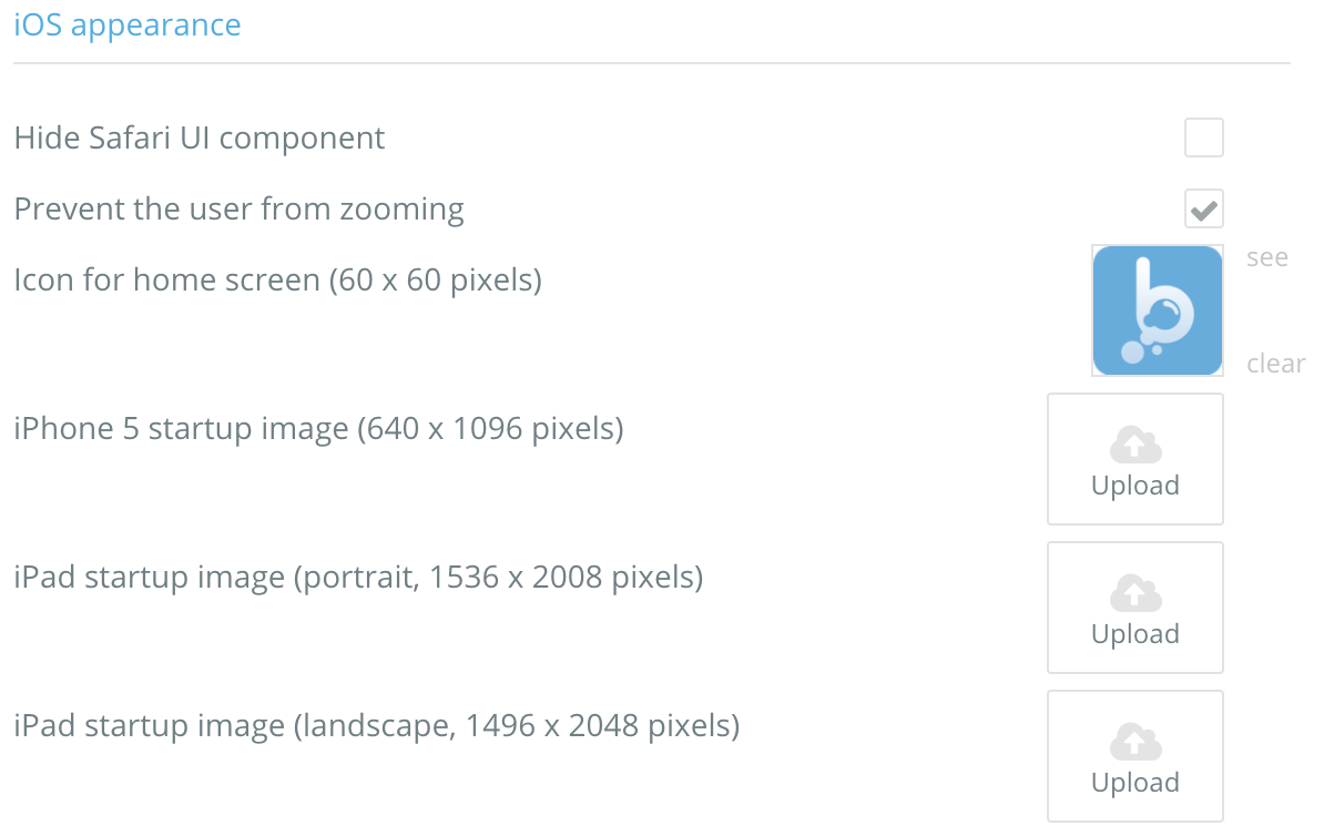
Apple enables developers to customize how their website looks on iPhones and iPads. The Settings tab is where you can customize this behavior without having to handcode the meta tags.
You can control the shortcut icon that would be used if a user creates an icon on the home screen, prevent users from zooming, etc.

Related videos
How to Create Your Own Color Palette
In this quick tip, we learn how to replace the default color palette colors with our own brand.
Last updated
Was this helpful?