> For the complete documentation index, see [llms.txt](https://manual.bubble.io/llms.txt). Markdown versions of documentation pages are available by appending `.md` to page URLs; this page is available as [Markdown](https://manual.bubble.io/core-resources/elements/container-layout-types.md).
# Container Layout Types
{% tabs %}
{% tab title="Experience level" %}
This core reference entry is suited for **beginner-level builders****.**
[Learn more about experience levels.](#user-content-fn-1)[^1]
{% endtab %}
{% tab title="In-depth articles (12)" %}
To learn about this topic more in-depth, we recommend reading the suggested articles below:
#### Responsive design
Article series focusing on design in general, explaining terminology and offering resources to help you set up a user-friendly, good looking design.
* Article series: [Design](/help-guides/design.md)
* Article: [Responsive design](/help-guides/design/responsive-design.md)
Building pages that work on all devices, such as a laptop and a phone.
* Article: [Container elements](/help-guides/design/elements/web-app/containers.md)\
Containers are elements that contain other elements.
* Page: [Introduction to responsive design](https://bubble.io/responsive-design)
***
#### Navigation
In this article we cover how to hide and show container elements to set up a single-page application
Article: [Navigation](/help-guides/logic/navigation.md) | [Single-Page Applications](/help-guides/logic/navigation/single-page-applications-spa.md)
***
**Other element categories**\
In this article series, we cover how to work with different element types:
* Article series:[ Elements](/help-guides/design/elements.md)
* Article series: [The element hierarchy](/help-guides/design/elements/the-element-hierarchy.md)
* Article: [The page](/help-guides/design/elements/web-app/the-page.md)
* Article series: [Container elements](/help-guides/design/elements/web-app/containers.md) (elements that contain other elements)
* Article: [Visual elements](/help-guides/design/elements/web-app/visual-elements.md) (elements like text, buttons, icons and images)
* Article series: [Input forms](/help-guides/design/elements/web-app/input-forms.md) (elements that accept input, such as text and file uploads)
* Article: [Conditional expressions](/help-guides/logic/conditions.md) (making your elements change appearance in response to varying conditions)
***
**The design tab**\
In this article we cover the different tools available in the design tab.
* Article: ´[The design tab](/help-guides/getting-started/navigating-the-bubble-editor/tabs-and-sections/design-tab.md)
***
**Previewing your app**
In this section about how to [preview your app](#user-content-fn-2)[^2] in the development environment.
* Article: [Previewing your app](/help-guides/getting-started/navigating-the-bubble-editor/previewing-your-app.md)
{% endtab %}
{% tab title="Videos (7)" %}
Bubble Academy: [How to Group Elements Together](https://www.youtube.com/watch?v=HWmgmzIQRfg)\
Bubble Academy: [Padding in Container Elements](https://www.youtube.com/watch?v=rR1eI6Lv4_I)\
Bubble Academy: [How to Use the Group Focus Element](https://www.youtube.com/watch?v=l_SbovrRt2s\&t=1s)\
Bubble Academy: [Creating Your First Repeating Group](https://www.youtube.com/watch?v=e6oQU__8pmE)\
Bubble Academy: [How to create a Masonry Grid Layout in a Repeating Group](https://www.youtube.com/watch?v=-asG45y04aI)\
Bubble Academy: [How to Use Repeating Group Layout Styles](https://www.youtube.com/watch?v=abMbztw-lmc)
Bubble Academy: [Element videos](https://www.youtube.com/@BubbleIO/search?query=element) (list of videos related to elements)
{% endtab %}
{% endtabs %}
Container layouts define the behavior and positioning of its child elements. Container layout types are available on any container element (group, floating group, repeating group, etc.), including the page itself. Your page must be a responsive container type (ie not “fixed”) to be actually responsive to changes in screen size. Each container layout type has its own set of controls specific to that layout type. In addition, child elements will inherit unique controls depending on the parent container’s selected layout type.
The new container layouts and their controls are outlined below and include sub-sections for Parent container and Child element controls.
{% hint style="info" %}
**Note:** Parent controls act on the container itself while the Child controls act on the child elements inside the parent container.
{% endhint %}
## **Fixed**
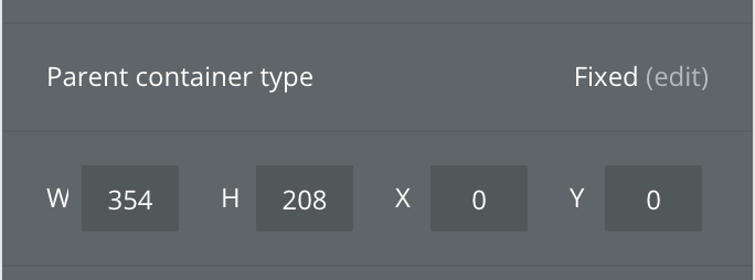
The Fixed layout type defines a fixed width and height container with absolute positioning of its child elements. Child elements are positioned and re-sized by dragging and dropping as you are used to. A container that is fixed will not respond to changes in screen size or content size because what-you-see-is-what-you-get.
#### Parent Controls
{% hint style="info" %}
Additional controls will be available dependent on the parent container of this element.
{% endhint %}
#### **Child Controls**
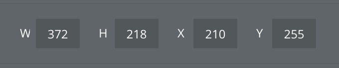
### Width & Height
See [Responsive Properties](/core-resources/elements/responsive-properties.md)
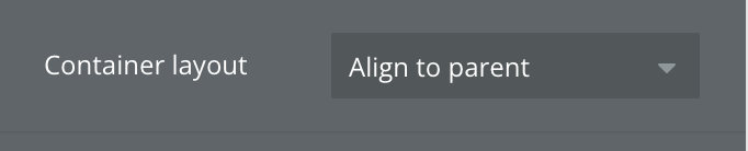
## **Align to Parent**
Child elements are aligned to a nonant in the parent container. A nonant is like a quadrant, but when a rectangle is divided into 9 parts instead of 4. New child elements drawn inside or dragged into an Align to Parent will snap to the nearest nonant.
The position and size of child elements are controlled in the property editor, though elements can be re-positioned by dragging and dropping. As the parent container resizes, child elements will remain aligned to their respective nonant and can overlap each other.
#### Parent Controls
{% hint style="info" %}
Additional controls will be available dependent on the parent container of this element.
{% endhint %}
#### Child Controls

### Pin to nonant selection
Select which nonant this element should be pinned to. The element will stay pinned there as the parent container resizes.
### Width & Height
See [Responsive Properties](/core-resources/elements/responsive-properties.md)
## **Row**
Child elements in a row container are aligned horizontally. These child elements will wrap as the screen is resized or new elements are added. New child elements drawn inside the container will be added to the end of the list by default but can be re-ordered using the order controls or by dragging and dropping.
The position and size of child elements are controlled in the property editor.
{% hint style="info" %}
**Note:** Child elements will grow to take up as much space as they can (within the limits of the max width setting) equally. For example, consider a parent row container that is 100px wide. It has two child elements with min widths of 20px and infinite max widths. These elements will grow to be 50px each. If we add a 3rd equal child element to that row, each element will shrink to 33.33 px wide.
{% endhint %}
#### Parent Controls
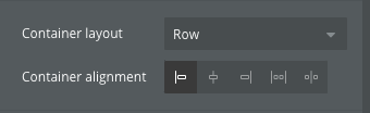
### Container alignment
This control defines how the child elements will be aligned with respect to the parent container.
#### Left-aligned
Child elements will align to the left edge of the parent.
#### Centered
Child elements will align to the center of the parent.
#### Right-aligned
Child elements will align to the right edge of the parent.
#### Space around
Child elements will receive even spacing between the edges of the parent container and each other.
#### Space between
Child elements are placed at the start and end of a container with even spacing between elements
### Row gap (px)
See [Responsive Properties](/core-resources/elements/responsive-properties.md)
### Column gap (px)
See [Responsive Properties](/core-resources/elements/responsive-properties.md)
### Width & Height
See [Responsive Properties](/core-resources/elements/responsive-properties.md)
{% hint style="info" %}
Additional parent controls will be available dependent on the parent container of this element.
{% endhint %}
**Child controls**
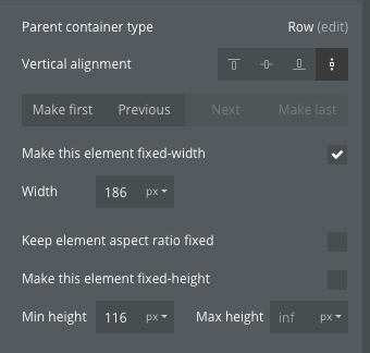
### Vertical alignment
#### Top-aligned
Child element will align to the top edge of the parent container
#### Centered
Child element will align to the center of the parent container
#### Bottom-aligned
Child element will align to the bottom of the parent container
#### Vertical stretch
Child element will stretch to its max height (or height of the parent container, whichever is smaller). This option is disabled if *Make this element fixed-height* is checked.
### Order selection
#### Make first
Move this element to the first position in the row.
#### Previous
Move this element one position to the left in the row.
#### Next
Move this element one position to the right in the row.
#### Make last
Move this element to the last position in the row.
### Width and Height
See See [Responsive Properties](/core-resources/elements/responsive-properties.md)
## **Column**
Content is aligned vertically. Child elements will stretch or push other elements down as screen or content is resized. New child elements drawn inside the container will be added to the end of the list but can be re-ordered using the order controls or by dragging and dropping.
Position and size are instead controlled in the property editor.
#### **Parent controls**

### Container alignment
This control defines how the child elements will be aligned with respect to the parent container.
#### Top-aligned
Child elements will align to the top edge of the parent.
#### Centered
Child elements will align to the center of the parent.
#### Bottom-aligned
Child elements will align to the bottom edge of the parent.
#### Space around
Child elements will receive even vertical spacing between the edges of the parent container and each other.
#### Space between
Child elements are placed at the start and end of a container with even vertical spacing between elements
### Row gap (px)
See [Responsive Properties](/core-resources/elements/responsive-properties.md)
### Width & **H**eight
See [Responsive Properties](/core-resources/elements/responsive-properties.md)
{% hint style="info" %}
Additional parent controls will be available dependent on the parent container of this element.
{% endhint %}
#### **Child controls**
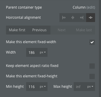
### Horizontal alignment
#### Left-aligned
Child element will align to the left edge of the parent**.**
#### Centered
Child element will align to the center of the parent.
#### Right-aligned
Child element will align to the right edge of the parent.
#### Horizontal stretch
Child element will stretch horizontally to its max width or the width of its parent container (whichever is less). This option is disabled if *Make this element fixed-width* is checked.
### Order selection
#### Make first
Move this element to the first position in the row.
#### Previous
Move this element one position to the left in the row.
#### Next
Move this element one position to the right in the row.
#### Make last
Move this element to the last position in the row.
### Width & **H**eight
See [Responsive Properties](/core-resources/elements/responsive-properties.md)
[^1]: In the Bubble docs, experience levels are categorized into beginner, intermediate, and advanced.
To assist with learning, especially for more complex topics, we'll recommend prerequisite reading where it could be beneficial.
[^2]: Every chance that you make in your app can be instantly previewed so that you can see how your app looks to your users.
User manual article: [Previewing your app](/help-guides/getting-started/navigating-the-bubble-editor/previewing-your-app.md)