Reusable Elements
This section covers reusable elements: elements that can be using in multiple places in your app
Last updated
This section covers reusable elements: elements that can be using in multiple places in your app
Last updated
Reusable elements are a way to create groups of elements that can be used in more than one place.
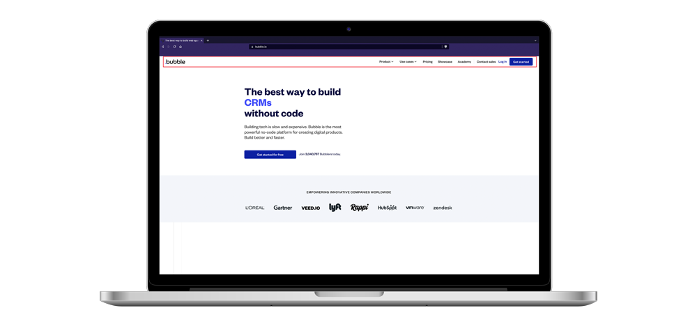
For example, if you have created a navigation toolbar, you may want that same toolbar to be visible on multiple pages, and only have to make changes to it once to update all of them.
Reusable elements contain elements, and and each instance of the reusable element behaves in isolation: in other words, what happens in one reusable element has no effect on other copies of the same reusable element, even if they're on the same page.
Reusable elements can be used for any collection of elements/workflows that you want to re-use across your app. To further illustrate what reusable elements are often used for, let's look at a few examples:
Navigation Bar: This is usually placed at the top of every page and provides links to the main sections of your app.
Footer: Like the navigation bar, a footer is a consistent element placed at the bottom of each page, containing information such as copyright notices, contact details, and additional links.
Login/Signup Form: forms reused across different pages for user authentication.
Search Bar: If your app includes a search function, you may want that feature to be present on multiple pages.
Buttons: Call to action (CTA) buttons like "Sign Up", "Buy Now", or "Learn More" can be standardized and used throughout your application.
Sidebar Menu: a sidebar menu may be present on multiple pages for navigation.
Pop-up Modals: Reusable pop-up windows for things like confirmation messages or user prompts.
Contact Forms: Standardized forms for user inquiries.
Data Cards: Card lists showing stuff like user profiles, eCommerce products and tourist destinations
Error Messages: Standardized error messages can be used across different scenarios and pages.
There are many reasons as to why you would want to use them:
Any change that you make to a reusable element is instantly visible across all instances of it. Instead of making changes in a lot of different places across your app, you can centralize the management of key features into one element.
By using reusable elements for designs that are used frequently, like forms, pop-ups, and footers, you give your app a consistent look and cut down on the work you have to do to maintain it.
If a page has lots of elements and workflows, putting some parts in reusable elements can make it easier to focus. This way, there are fewer things to keep track of on the screen at the same time.
Reusable elements keep your app lightweight and performant, since its content only needs to be loaded once.
Reusable elements can also be used to store workflows that you use in multiple places across your app. In fact, a reusable element doesn't have to contain any visible elements – you can use it to simply .
Reusable elements can be created as one of the following container types:
Group: used to contain other elements
Popup: used to contain other elements and hover centered above all other content on the page
Floating group: used to contain other elements and hover near an edge of the screen (such as a navigation toolbar)
Each of these types behave in the same way that their container element counterparts do. You can read more about the different types in our article series on containers.
Article series: Containers
There are multiple ways to create new reusable elements:
To create a new blank reusable element:
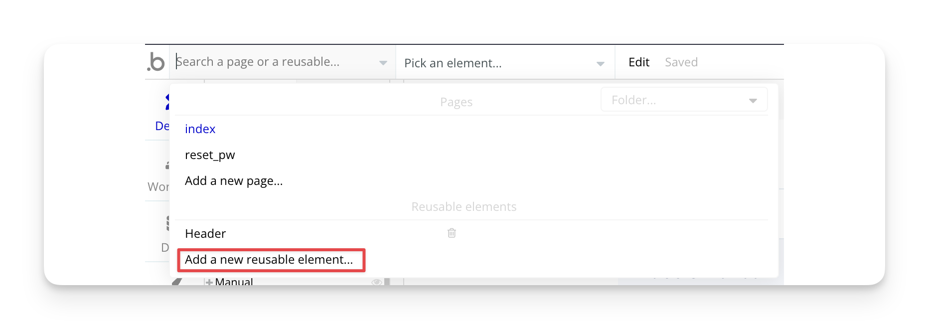
Open the page navigation menu in the upper left corner of the Bubble editor
Scroll to the Reusable elements section
Click Add a new reusable element
You can also create a blank reusable element using the :
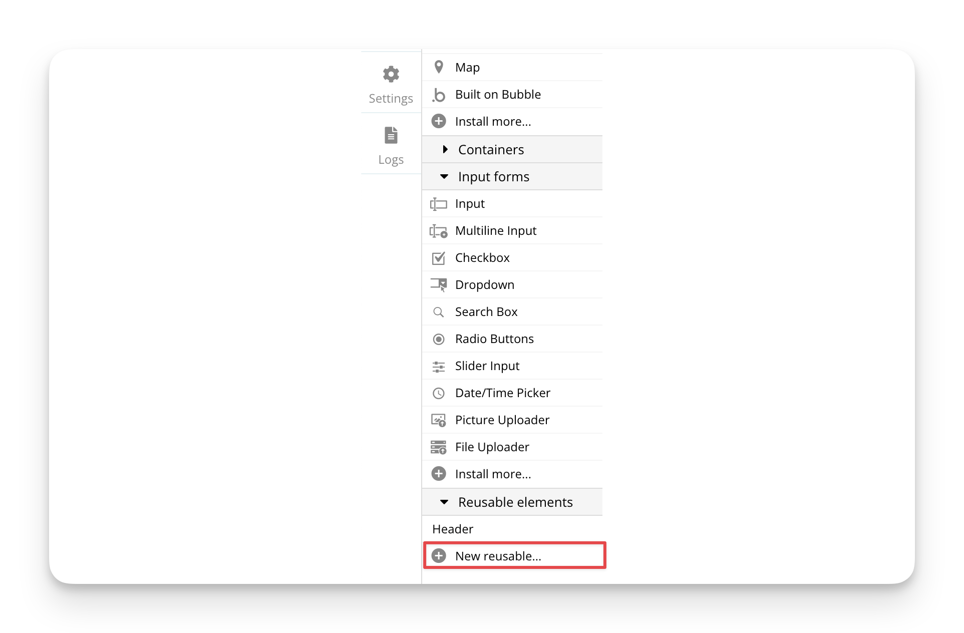
Navigate to the Design tab of the Bubble editor
In the element tree, scroll down to the Reusable elements section
Click New reusable
You can also convert one or more elements on a page into a reusable element:
If you select a container element, a new reusable element will be created, containing the child elements inside of the original container
If you select one or more elements, a new reusable element will be created containing those elements
The original elements on the page will not be deleted or replaced with the newly created reusable element
Any workflows associated with the selected elements will be copied into the new reusable element, but may break if they lose access to original references
To convert existing containers or elements into a reusable, do the following:
Select one or more elements on the page
Right-click the mouse on one of the selected elements or click the Edit menu at the top of the screen
Select Convert to a reusable element
A new reusable element will be created and you will be taken to that element in the editor.
In many cases you'll need to pass data to and from a reusable element. There are a few different ways to do this:
When a reusable element has a Type of content set and it's been placed on the page, you can set a data source for it. For example, if the reusable element has a data type called Product as its type of content, you can set any product in your database as the data source on the page where the reusable element is placed.
This method works one direction: passing data from the parent to the reusable element.
The Display data action can be used to send any kind of data to the reusable element, as long as it matches the Type of content set on that element. For example, if you have a form to edit someone's user profile, you can send the relevant user data to the reusable element using the display data action.
This method works both directions: passing data from the parent to the reusable element or vice versa.
You can also pass data from the parent page to a reusable element using the Set state of an element action:
Set up the relevant custom state with the correct data type on the reusable element. The custom state needs to be create on the parent reusable element, not any of its children
Use the Set state of an element action to populate the custom state with data
This method works in both directions: passing data from the parent to the reusable element or vice versa.
do not pass data directly into a reusable element per sé, but since they can be read and manipulated by both the page and any reusable element within that page, they can be a useful way to share information between the two.
This method works in both directions: passing data from the parent to the reusable element or vice versa.
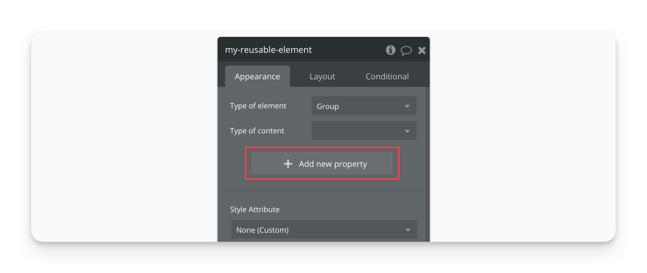
Reusable elements also come with customizable properties that can be set up to share dynamic data between it and other elements such as the parent page.
Properties can be populated by a default value assigned on the reusable element itself or from the parent. Any new property that you add will be assigned a field on each instance of that reusable element placed on a page, and they can be individually assigned data.
The data populated in the fields are prioritized in order of 1) data assigned from the parent, and 2) default data, meaning that the data from the parent element takes priority.
Unlike custom states (that require an action to be assigned a value), reusable element properties let you use dynamic data. Unlike the Type of content field that all resuable elements have, you can set up as many different properties as you need, each with individual data types.
You set select one of three types for any new property.
Dynamic value lets you assign any or that you can then populate using a dynamic expression, such as a database search, an option set or something else. This is useful for passing different types of data dynamically to and from the reusable element.
Color picker lets you assign a or a saved . This is useful for dynamically passing a color value to the reusable element. You can then use that color to communicate something to your users, such as a different background, button or text color.
Checkbox is a simple way to pass a to or from the reusable.
This method works in both directions: passing data from the parent to the reusable element or vice versa.
Let's revisit the point that reusable element properties can pass data not only to a reusable element, but from the element to the parent. This value can then be read by any element on the parent, allowing you to pass dynamic data to other elements on that page without having to use actions.
The fact that you can keep dynamic values updated automatically between a reusable element and its parent opens up for scenarios where you can use the reusable element to store different variables that you use elsewhere on the page and manage from one place.
To add an existing reusable element to a page, navigate to the Reusable elements section of the , click the element that you want to add, and then click on the area where you want to add it to a page.
Reusable elements' dimensions are defined when you edit the element itself. However, these elements are responsive (except if you make them fixed width), and if you need to resize them in the destination page you can do so, and the content will adjust as defined with the responsive settings of the inner elements.