> For the complete documentation index, see [llms.txt](https://manual.bubble.io/llms.txt). Markdown versions of documentation pages are available by appending `.md` to page URLs; this page is available as [Markdown](https://manual.bubble.io/core-resources/elements/containers.md).
# Containers
{% tabs %}
{% tab title="Experience level" %}
This core reference entry is suited for **beginner-level builders****.**
[Learn more about experience levels.](#user-content-fn-1)[^1]
{% endtab %}
{% tab title="In-depth articles (12)" %}
To learn about this topic more in-depth, we recommend reading the suggested articles below:
Article: [Container elements](/help-guides/design/elements/web-app/containers.md)
***
#### Navigation
In this article we cover how to hide and show container elements to set up a single-page application
Article: [Navigation](/help-guides/logic/navigation.md) | [Single-Page Applications](/help-guides/logic/navigation/single-page-applications-spa.md)
***
**Other element categories**\
In this article series, we cover how to work with different element types:
* Article series:[ Elements](/help-guides/design/elements.md)
* Article series: [The element hierarchy](/help-guides/design/elements/the-element-hierarchy.md)
* Article: [The page](/help-guides/design/elements/web-app/the-page.md)
* Article series: [Container elements](/help-guides/design/elements/web-app/containers.md) (elements that contain other elements)
* Article: [Visual elements](/help-guides/design/elements/web-app/visual-elements.md) (elements like text, buttons, icons and images)
* Article series: [Input forms](/help-guides/design/elements/web-app/input-forms.md) (elements that accept input, such as text and file uploads)
* Article: [Conditional expressions](/help-guides/logic/conditions.md) (making your elements change appearance in response to varying conditions)
***
**The design tab**\
In this article we cover the different tools available in the design tab.
* Article: ´[The design tab](/help-guides/getting-started/navigating-the-bubble-editor/tabs-and-sections/design-tab.md)
***
#### Design
Article series focusing on design in general, explaining terminology and offering resources to help you set up a user-friendly, good looking design.
* Article series: [Design](/help-guides/design.md)
* Article: [Responsive design](/help-guides/design/responsive-design.md)
Building pages that work on all devices, such as a laptop and a phone.
***
**Previewing your app**
In this section about how to [preview your app](#user-content-fn-2)[^2] in the development environment.
* Article: [Previewing your app](/help-guides/getting-started/navigating-the-bubble-editor/previewing-your-app.md)
{% endtab %}
{% tab title="Videos (7)" %}
Bubble Academy: [How to Group Elements Together](https://www.youtube.com/watch?v=HWmgmzIQRfg)\
Bubble Academy: [Padding in Container Elements](https://www.youtube.com/watch?v=rR1eI6Lv4_I)\
Bubble Academy: [How to Use the Group Focus Element](https://www.youtube.com/watch?v=l_SbovrRt2s\&t=1s)\
Bubble Academy: [Creating Your First Repeating Group](https://www.youtube.com/watch?v=e6oQU__8pmE)\
Bubble Academy: [How to create a Masonry Grid Layout in a Repeating Group](https://www.youtube.com/watch?v=-asG45y04aI)\
Bubble Academy: [How to Use Repeating Group Layout Styles](https://www.youtube.com/watch?v=abMbztw-lmc)
Bubble Academy: [Element videos](https://www.youtube.com/@BubbleIO/search?query=element) (list of videos related to elements)
{% endtab %}
{% endtabs %}
## Containers
Containers are elements that can contain other elements. They are used to keep groups of elements in one place, control parts of their responsive settings and opacity, and for navigation.
## Group
Groups are elements that contain other elements. A group has two roles. First, a group gathers elements from a visual perspective, and all the elements in that group move together. It also has a semantic significance. A group can have data injected into it, and the elements inside the group can refer to the Parent group's thing. For example, you can 'display' a user in a group, and all elements inside that group will be able to display the 'Parent group's user's email.' Use this functionality when you want some areas of the app's page to display items relative to a dynamic entry.
{% embed url="" %}
Our Academy quick tip on how to group elements together
{% endembed %}
### Container layout
A Group's container layout defines it's and it's child elements responsive behavior. See more in [Container Layout Types.](/core-resources/elements/container-layout-types.md)
### Type of content
This allows you to select the type of thing this container displays. Most elements that have this property also have a Data source property, which lets you select the displayed thing or list of things. The value of the data source must match the selected type of content.\
\
Let's look at an example of a map with hotels marked. When you click a marker, a popup displays with the name of the hotel. The Type of content would be 'Hotel' and the Data source would be 'Map's current marker.'
### Data source
Define the thing or list of things that should be displayed in this container. For example, in groups or popups, only a single thing will display, but for repeating groups a list of things will display.\
\
Child elements can access the Data source from their parent. If the parent contains a list of things, the child has access to the individual list items.\
\
A common scenario for groups is to display something, like the current user, and then have the group contain the inputs that modify the user's properties, such as text and images that display information about the user.\
\
The Type of content determines what kind of thing you are allowed to set in the Data source field. If the type of thing does not match the Data source, it will be marked as an issue, and you must change one or the other to match.\
\
The Data source can come from anywhere in Bubble. For example, it could be the result of a search, a custom or built-in Data source, or it could be dynamic and come from the user. The Data source will update when its source changes. For example, if the search result changes because a user modified some data used in the search constraints, the displayed list will automatically change. For additional flexibility, you can update the Data source in the Conditional Formatting Tab in the Property Editor.\
\
Finally, the Data source property can be modified by workflows. Changes made by actions override whatever you specify as the Data source directly or as a conditional state until you run a reset action, which then restores the original setting.
{% hint style="warning" %}
**Note:** As mentioned, Groups can have data assigned to them (e.g. 'this group should show data about user X'). When the data assigned to a group changes, the group will reset all the input fields within itself.
This is useful when the input fields are supposed to change depending on the group's data. But, it can also cause confusion, for example, when a group's data depends on an input that's inside that group!
{% endhint %}
### Collapse when hidden
By default, hiding an element leaves a blank space on the page, exposing whatever is underneath it. When you select this option, however, the elements below the hidden element are pulled upward to fill the space.
{% hint style="info" %}
**Tip:** A common pattern for a messaging UI involves a Repeating Group where cells have two Groups (Sender & Receiver) that display the text sent by each respective party. When the message belongs to the Sender, the Receiver group is hidden and vice versa.
Because of a race condition between evaluating conditional visibility of groups in Repeating Group cells and evaluating cell height, blank spaces may appear when switching between the two groups when a new message is sent.
To minimize the risk of this happening, consider enabling "Collapse this element's height when hidden" on both Groups.
{% endhint %}
### Animate the collapse operation
This option is only visible if 'Collapse this element's height when hidden' is selected. By default, elements collapse and expand instantly, but this option animates with either Fade In/Out or Slide Up/Down.
### Animation style
This option allows you to choose whether an element's animation will Fade In/Out or Slide Up/Down.
{% hint style="warning" %}
**Note:** Animation Style is not currently supported for use on a group in situations where a repeating group's underlying data is changing. In these situations, consider relying on the repeating group's built-in updating instead of adding an animation.
{% endhint %}
### Start/Edit workflow
Click this button to create a new workflow triggered by this element. The type of event depends on the element and is generally the most common event.\
\
For example, buttons will create a 'When this element is clicked...' event. If a workflow already exists, this takes you to the existing workflow in the Workflow Tab. To create a different type of event or create a second event, go to the Workflow Tab and click the 'Click here to add an event...' button.
### This element isn't clickable
When checked, the element will not trigger a workflow when clicked nor will the user's cursor change to a pointer when they hover over the element. In addition, the item will display according to any specified conditional formatting for the 'isn't clickable' state.\
\
This can be used to stop a user from moving forward in a flow until some condition is true. For example, we might disable a specific action until the user is logged in. 'This input should not be empty' can also be used to prevent the user from clicking.
{% hint style="info" %}
**Tip:** Conditionally changing the borders of a Group will not resize the content in the group, which can lead to undesirable formatting. Consider using two groups (one without a border), and toggling between the two if this behavior is desired.
{% endhint %}
## Repeating Group
{% hint style="info" %}
For a more in-depth look at repeating groups, read our dedicated Manual article on the subject:
Article: [Repeating groups](/help-guides/design/elements/web-app/containers/repeating-groups.md)
{% endhint %}
A repeating group displays lists of things, either coming from the application database or from APIs. Design the first cell, and the remaining cells will follow that design.
### Type of content
This allows you to select the type of thing this container displays. Most elements that have this property also have a Data source property, which lets you select the displayed thing or list of things. The value of the data source must match the selected type of content.\
\
Let's look at an example of a map with hotels marked. When you click a marker, a popup displays with the name of the hotel. The Type of content would be 'Hotel' and the Data source would be 'Map's current marker.'
### Data source
This is the list of things to display in the group. It can either be
* The result of a search using 'Do a search for,'
* The content of a field whose type is list of things, or
* The result of an API call through the 'Get data from an external API.'
Once this is set, each cell will display one thing, and the elements drawn inside the cell will be able to refer to the 'Current cell's thing.'
{% hint style="warning" %}
**Note:** Avoid the situation where you automatically change the data source of a repeating group based on a condition that references the repeating group itself! This will cause an infinite loop and the repeating group will not behave as you expect.
{% endhint %}
### Layout settings
### Fixed # of rows or columns
Check fixed number of rows or column if you'd like to display a fixed number of rows or columns in run mode, regardless of the screen size or number of entries in the List. Check both boxes to recreate the legacy Fixed number of cells repeating group layout.
#### 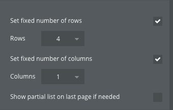
### Set fixed number of rows
Check this box to have the repeating group show a fixed number of rows. Cell height will be determined by the height of the overall repeating group container divided by the number of rows specified. Use the show next / show previous workflow actions to paginate the table and show more data.
### Rows
Set the number of rows you’d like to display.
### Set fixed number of columns
Check this box to have the repeating group show a fixed number of columns. Cell width will be determined by the width of the overall repeating group container divided by the number of columns specified. Use the show next / how previous workflow actions to show more data.
### Columns
Set the number of columns you’d like to display.
### Show partial list on last page if needed
Check this box to show a less than specified number of rows or columns on the last page of a paginated table if needed.
### **Dynamic # of rows or columns**
Uncheck fixed number of rows or column if you'd like to display a dynamic number of rows or columns in run mode - i.e. to recreate legacy vertical scrolling or horizontal scrolling repeating group layouts.
{% hint style="warning" %}
Scrollbars, especially when in repeating groups, can sometimes cause elements to appear slightly different than designed on certain browsers and devices. This is because Bubble relies on the end-user's operating system and browser to determine how a scrollbar should look.
{% endhint %}
#### 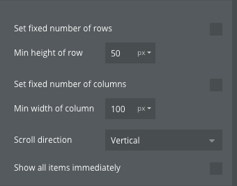
### Min height of row
Specify a minimum Repeating Group row height. The Repeating Group will default to filling as many cells as the data allows at the minimum height, and then grow in size evenly to fill the remaining space.
{% hint style="info" %}
For example, if you have a repeating group with a height of 440px, a min height of 100px, and 5 entries in your List, the repeating group in run-mode will initially show 4 cells at a height of 110px each.
{% endhint %}
### Stretch rows to fill vertical space
If [Set fixed number of rows](#set-fixed-number-of-rows) is unchecked, you can choose whether to stretch all rows to fill the available vertical space. If the rows at their minimum height do not fill the space, each row will expand to match the tallest content, making all rows equal in height.
{% hint style="warning" %}
If this setting is checked, the Display items as masonry grid option will not be available since that setting requires elements to fit height to their content.
{% endhint %}
### Min width of column
Specify a minimum Repeating Group column width. The Repeating Group will default to filling as many cells as the Repeating Group Container width allows at the minimum cell width, and then grow in size evenly to fill the remaining space.
{% hint style="info" %}
For example, if you have a repeating group with a width of 440px, a min width of 200px, and 10 entries, the repeating group in run-mode will initially show a repeating group with 2 columns at a width of 220px each.
{% endhint %}
### Stretch columns to fill horizontal space
If [Set fixed number of columns](#set-fixed-number-of-columns) is unchecked, choose whether to stretch columns to fill horizontal space. If columns at min width aren't wide enough to fill horizontal space, each column will stretch in width to do so.
{% hint style="info" %}
If this setting is unchecked, the amount of data that is loaded will not impact the number of columns rendered on the page. For example, if 6 columns are able to fit within the Repeating Group container, but there are only two pieces of data in the List, 6 columns will still be rendered. On the other hand, if this setting is checked, the two columns with data will stretch to fit the amount of space available.
{% endhint %}
### Scroll direction
If [Set fixed number of rows](#set-fixed-number-of-rows) and [Set fixed number of columns](#set-fixed-number-of-columns) are both unchecked, choose the direction you’d like the repeating group to scroll.
#### Vertical
Select this option if you'd like your repeating group to scroll vertically if the amount of rows takes up more space than the parent container allows. This is usually the most common option.
#### Horizontal
Select this option if you'd like your repeating group to scroll horizontally if the amount of rows takes up more space than the parent container allows.
#### Wrapped horizontally
Select this option if you'd like the items in your repeating group to wrap to a new row if the number of items takes up more space than the parent container allows. Use this setting if you'd like to create a "tag" like list where columns fit width to their content and do not need to be evenly sized.
{% hint style="info" %}
This option has access to [Row gap](/core-resources/elements/responsive-properties.md#row-gap-px) and [Column gap](/core-resources/elements/responsive-properties.md#column-gap-px) settings.
{% endhint %}
#### Reverse scroll direction
Check this box to show the first item in a repeating group on the bottom instead of the top. Adding items to the front of the list will show on the bottom, while scrolling upwards will show the end of the list. This option requires a fixed height, the scroll direction to be “vertical” or to have a fixed number of columns, and no fixed number of rows.
### Show all items immediately
Check this box to load all of the data right away. This is similar to legacy Full List repeating group behavior.
### Display items as masonry grid
Check this box to display the data in your repeating group as a "pinterest style" grid. The masonry grid setting allows each cell to take up only as much space as needed in each column's row, as opposed to requiring a fixed row height across all columns like normal repeating group tables. This setting is only available when [Set fixed number of rows](#set-fixed-number-of-rows) is unchecked.
{% embed url="" %}
{% hint style="warning" %}
If this setting is checked, the [Stretch rows to fill vertical space](#stretch-rows-to-fit) option will not be available since this setting requires elements to fit height to their content.
{% endhint %}
### Container layout type
A repeating group cell is a container as well and can have one of the following 4 container layout types: [Fixed](/core-resources/elements/container-layout-types.md#fixed), [Align to parent](/core-resources/elements/container-layout-types.md#align-to-parent), [Row](/core-resources/elements/container-layout-types.md#row), and [Column](/core-resources/elements/container-layout-types.md#column). Select the appropriate container layout type depending on what child element behavior you want.
### Separator Style
Select the type of border to display between the cells. Choose from None or a stylized line, such as Solid, Dashed, and Double.
### Separator Width
Enter the width to apply to the separator in pixels. Set a width even with a separator of None. In this case, the cells will have some empty space between them.
### Separator Color
Select the separator color.
### Start/Edit workflow
Click this button to create a new workflow triggered by this element. The type of event depends on the element and is generally the most common event.\
\
For example, buttons will create a 'When this element is clicked...' event. If a workflow already exists, this takes you to the existing workflow in the Workflow Tab. To create a different type of event or create a second event, go to the Workflow Tab and click the 'Click here to add an event...' button.
### This element isn't clickable
When checked, the element will not trigger a workflow when clicked nor will the user's cursor change to a pointer when they hover over the element. In addition, the item will display according to any specified conditional formatting for the 'isn't clickable' state.\
\
This can be used to stop a user from moving forward in a flow until some condition is true. For example, we might disable a specific action until the user is logged in. 'This input should not be empty' can also be used to prevent the user from clicking.
## Table element
{% hint style="info" %}
For a more in-depth look at the table element, read our dedicated Manual article on the subject:
Article: [The table element](/help-guides/design/elements/web-app/containers/table-elements.md)
{% endhint %}
### Table element
#### Type of content
This allows you to select the data type this container displays, such as User.
#### Data source
The table element expects a list of things to be returned. Each cell of the table element’s repeating rows can then refer to the Current cell’s thing.
#### Table direction
This property determines whether the content of the table is loaded vertically (along the Y-axis) or horizontally (along the X-axis). The setting affects both static and repeating rows/columns)
#### Vertical and horizontal separators
This property lets you enable and set the styling options for the vertical and horizontal separators. Note that these settings can be affected by the [*Table direction*](#table-direction) setting.
### Static rows/columns
Note: Whether the settings below are applied to rows or columns depends on the Table orientation setting on the table element.
#### Make this row/column sticky
This property enables the row to be fixed at the top of the element, ensuring it stays visible as you scroll through the rows below. This is particularly useful for keeping headers or key information in sight while navigating extensive data sets.
### Repeating rows/columns
#### Set fixed number of repeating rows/columns
This property instructs Bubble to only display a set number of repeating rows in the table. Checking it will reveal the setting below to set the number of rows.
#### Row/column count
This property sets the maximum number of rows that you want to display. If the data source contains a list that is shorter than the maximum number of rows set, Bubble will only display the number of rows equal to the length of the list.
When working with the table element, the [**contextual menu** ](#user-content-fn-3)[^3]offers a lot of different options for managing table rows and columns. You can read more about this in the reference entry for the contextual menu.
{% hint style="info" %}
Working with the table element introduces a lot of new options to Bubble's [**contextual menu**](#user-content-fn-4)[^4]. You can see a list of all of these options in the contextual menu reference entry.
Reference: [Contextual menu](/core-resources/bubbles-interface/top-and-context-menu-options.md#cut-column) (table element entries)
{% endhint %}
## Popup
Popups are hidden from the user until you display them from the Workflow Tab. When they are visible, they are fixed position in the center of the viewport. If the popup is longer than the viewport, the user will be able to scroll to see the full content. If the popup is shorter than the viewport, the user will not be able to scroll.
{% embed url="" %}
Our Academy quick tip on how to use popups
{% endembed %}
{% hint style="info" %}
**Tip:** If the popup is longer than the viewport, scrolling will be enabled, and scroll distance is tied to the length of the page in the background. If you have a very long page, the user will be able to continue scrolling the entire length of the background page, potentially past the point where the popup is no longer visible.
{% endhint %}
### Type of content
This allows you to select the type of thing this container displays. Most elements that have this property also have a Data source property, which lets you select the displayed thing or list of things. The value of the data source must match the selected type of content.\
\
Let's look at an example of a map with hotels marked. When you click a marker, a popup displays with the name of the hotel. The Type of content would be 'Hotel' and the Data source would be 'Map's current marker.'
### Data source
Define the thing or list of things that should be displayed in this container. For example, in groups or popups, only a single thing will display, but for repeating groups a list of things will display.\
\
Child elements can access the Data source from their parent. If the parent contains a list of things, the child has access to the individual list items.\
\
A common scenario for groups is to display something, like the current user, and then have the group contain the inputs that modify the user's properties, such as text and images that display information about the user.\
\
The Type of content determines what kind of thing you are allowed to set in the Data source field. If the type of thing does not match the Data source, it will be marked as an issue, and you must change one or the other to match.\
\
The Data source can come from anywhere in Bubble. For example, it could be the result of a search, a custom or built-in Data source, or it could be dynamic and come from the user. The Data source will update when its source changes. For example, if the search result changes because a user modified some data used in the search constraints, the displayed list will automatically change. For additional flexibility, you can update the Data source in the Conditional Formatting Tab in the Property Editor.\
\
Finally, the Data source property can be modified by workflows. Changes made by actions override whatever you specify as the Data source directly or as a conditional state until you run a reset action, which then restores the original setting.
### This popup can't be closed by pressing 'Esc'
By default, popups can be closed by the user when pressing the *Esc* button or clicking outside of the popup with the mouse. To disable this behavior and make the popup modal, check this box.
In this case, the only way to close the popup is with a Hide Popup action in a workflow.
### Grayout color
Select the color of the background when a popup is open. By default, it is set to a dark transparent layer.
### Grayout blur
Enter a number greater than 0 to set a blur effect on the background. While this offers an interesting design, the display speed of the popup may be affected.
### Start/Edit workflow
Click this button to create a new workflow triggered by this element. The type of event depends on the element and is generally the most common event.\
\
For example, buttons will create a 'When this element is clicked...' event. If a workflow already exists, this takes you to the existing workflow in the Workflow Tab. To create a different type of event or create a second event, go to the Workflow Tab and click the 'Click here to add an event...' button.
### This element isn't clickable
When checked, the element will not trigger a workflow when clicked nor will the user's cursor change to a pointer when they hover over the element. In addition, the item will display according to any specified conditional formatting for the 'isn't clickable' state.\
\
This can be used to stop a user from moving forward in a flow until some condition is true. For example, we might disable a specific action until the user is logged in. 'This input should not be empty' can also be used to prevent the user from clicking.
## Floating Group
{% embed url="" %}
Watch our Academy quick tip on how to set up a floating group
{% endembed %}
Floating groups are groups that float on the screen on top of the page but are not contained within the page. These are useful to keep an element in the same place on the screen regardless of the scrolling position of the page or the visibility of groups within the page. Floating groups are useful for headers, buttons like 'Scroll to top,' etc.
### Type of content
This allows you to select the type of thing this container displays. Most elements that have this property also have a Data source property, which lets you select the displayed thing or list of things. The value of the data source must match the selected type of content.\
\
Let's look at an example of a map with hotels marked. When you click a marker, a popup displays with the name of the hotel. The Type of content would be 'Hotel' and the Data source would be 'Map's current marker.'
### Data source
Define the thing or list of things that should be displayed in this container. For example, in groups or popups, only a single thing will display, but for repeating groups a list of things will display.\
\
Child elements can access the Data source from their parent. If the parent contains a list of things, the child has access to the individual list items.\
\
A common scenario for groups is to display something, like the current user, and then have the group contain the inputs that modify the user's properties, such as text and images that display information about the user.\
\
The Type of content determines what kind of thing you are allowed to set in the Data source field. If the type of thing does not match the Data source, it will be marked as an issue, and you must change one or the other to match.\
\
The Data source can come from anywhere in Bubble. For example, it could be the result of a search, a custom or built-in Data source, or it could be dynamic and come from the user. The Data source will update when its source changes. For examle, if the search result changes because a user modified some data used in the search constraints, the displayed list will automatically change. For additional flexibility, you can update the Data source in the Conditional Formatting Tab in the Property Editor.\
\
Finally, the Data source property can be modified by workflows. Changes made by actions override whatever you specify as the Data source directly or as a conditional state until you run a reset action, which then restores the original setting.
### Vertically float relative to
Using this dropdown menu, choose the base to calculate the position of the floating group. Choose from:\
– Top: The distance between the top edge of the group and the top of the user's screen remains constant, no matter the scrolling position of the page. This is the default.\
– Bottom: The distance between the bottom of the group and the user's screen remains constant no matter the scrolling position of the page.\
– Both: Both the top and bottom distances will remain constant, and a scrollbar will appear if the group is too short to show all its content.\
– Nothing: The floating group will not float, meaning that it behaves like a regular group.\
\
For example, the distance is calculated as the height between the top edge of the floating group and the top of the Bubble page. Then, it displays the floating group that distance from the top of the user's screen.\
Note: By placing the floating group high on the page and making it float relative to the bottom, the element may be 'above' the top of the screen and not display.
### Horizontally float relative to
Use this dropdown menu to determine whether the element floats relative to the Right or Left. Right and Left refer to the horizontal edges of the page. This option is less common than vertical reference, but it is useful when you want an element to display no matter the page width.
### Floating zindex
Floating groups can be above other elements or beneath the page, and then be used as a background design option. Note that when a floating element is beneath elements, it will only visible if the page background is transparent
### Parallax effect factor
When a floating group is beneath the page, you can apply a parallax effect to give some depth to the page. A factor of 1 will remove any parallax effect, while a factor of 0 will keep the element fixed, and a factor of 2 will make the element move twice faster than the scrolling position. A negative number will have the element move into the different direction of the scroll movement.
### Start/Edit workflow
Click this button to create a new workflow triggered by this element. The type of event depends on the element and is generally the most common event.\
\
For example, buttons will create a 'When this element is clicked...' event. If a workflow already exists, this takes you to the existing workflow in the Workflow Tab. To create a different type of event or create a second event, go to the Workflow Tab and click the 'Click here to add an event...' button.
### This element isn't clickable
When checked, the element will not trigger a workflow when clicked nor will the user's cursor change to a pointer when they hover over the element. In addition, the item will display according to any specified conditional formatting for the 'isn't clickable' state.\
\
This can be used to stop a user from moving forward in a flow until some condition is true. For example, we might disable a specific action until the user is logged in. 'This input should not be empty' can also be used to prevent the user from clicking.
## Group Focus
{% embed url="" %}
Watch our Academy quick tip on how to set up a Group Focus
{% endembed %}
A group focus is a group that is automatically hidden when the user clicks outside of it. Position it relative to another element. This is especially useful for dropdown menus.
{% hint style="warning" %}
**Note:** Although the Group Focus container is fixed relative to the page, the iOS keyboard appear event can cause the Group Focus container to move to an unexpected location due to how Apple handles this event.
{% endhint %}
{% hint style="info" %}
**Tip:** The same element can be used to open and close a group focus element. Best practice would be to use a "Toggle an element" workflow action on the element to simply open & close the group focus.
{% endhint %}
{% hint style="warning" %}
**Note:** If you have a searchbox within your Group Focus, clicking one of the searchbox's results will be considered clicking "outside" the Group Focus and therefore close it. A dropdown or custom searchbox are often used in these designs instead.
{% endhint %}
### Reference element
Specify an element to be the location reference for the group.
### Offset top
Pushes the group this number of pixels below the reference element.
### Offset left
Pushes the group this number of pixels left of the reference element.
### Type of content
This allows you to select the type of thing this container displays. Most elements that have this property also have a Data source property, which lets you select the displayed thing or list of things. The value of the data source must match the selected type of content.\
\
Let's look at an example of a map with hotels marked. When you click a marker, a popup displays with the name of the hotel. The Type of content would be 'Hotel' and the Data source would be 'Map's current marker.'
### Data source
Define the thing or list of things that should be displayed in this container. For example, in groups or popups, only a single thing will display, but for repeating groups a list of things will display.\
\
Child elements can access the Data source from their parent. If the parent contains a list of things, the child has access to the individual list items.\
\
A common scenario for groups is to display something, like the current user, and then have the group contain the inputs that modify the user's properties, such as text and images that display information about the user.\
\
The Type of content determines what kind of thing you are allowed to set in the Data source field. If the type of thing does not match the Data source, it will be marked as an issue, and you must change one or the other to match.\
\
The Data source can come from anywhere in Bubble. For example, it could be the result of a search, a custom or built-in Data source, or it could be dynamic and come from the user. The Data source will update when its source changes. For examle, if the search result changes because a user modified some data used in the search constraints, the displayed list will automatically change. For additional flexibility, you can update the Data source in the Conditional Formatting Tab in the Property Editor.\
\
Finally, the Data source property can be modified by workflows. Changes made by actions override whatever you specify as the Data source directly or as a conditional state until you run a reset action, which then restores the original setting.
### Collapse this element's height when hidden
By default, hiding an element leaves a blank space on the page, exposing whatever is underneath it. When you select this option, however, the elements below the hidden element are pulled upward to fill the space.
### Animate the collapse operation
This option is only visible if 'Collapse this element's height when hidden' is selected. By default, elements collapse and expand instantly, but this option animates with either Fade In/Out or Slide Up/Down.
### Animation style
This option allows you to choose whether an element's animation will Fade In/Out or Slide Up/Down.
### Start/Edit workflow
Click this button to create a new workflow triggered by this element. The type of event depends on the element and is generally the most common event.\
\
For example, buttons will create a 'When this element is clicked...' event. If a workflow already exists, this takes you to the existing workflow in the Workflow Tab. To create a different type of event or create a second event, go to the Workflow Tab and click the 'Click here to add an event...' button.
### This element isn't clickable
When checked, the element will not trigger a workflow when clicked nor will the user's cursor change to a pointer when they hover over the element. In addition, the item will display according to any specified conditional formatting for the 'isn't clickable' state.\
\
This can be used to stop a user from moving forward in a flow until some condition is true. For example, we might disable a specific action until the user is logged in. 'This input should not be empty' can also be used to prevent the user from clicking.
## Other ways to learn
User manual articles
#### Containers
This article series covers the different container element types in Bubble:
Article series: [Containers](/help-guides/design/elements/web-app/containers.md)
#### **Elements**
This article series covers how elements work, how to place them on the page to design your app and edit their attributes to make them look and behave like you want
Article series: [Elements](/help-guides/design/elements.md)
#### Responsive design
Responsive design means to design your app so that it works on all screen sizes and resolutions (desktop, tablets and mobile) and make your elements behave in a consistent way with pixel-perfect design. Containers are an important part of responsive design.
Article series: [Responsive design](/help-guides/design/responsive-design.md)
[^1]: In the Bubble docs, experience levels are categorized into beginner, intermediate, and advanced.
To assist with learning, especially for more complex topics, we'll recommend prerequisite reading where it could be beneficial.
[^2]: Every chance that you make in your app can be instantly previewed so that you can see how your app looks to your users.
User manual article: [Previewing your app](/help-guides/getting-started/navigating-the-bubble-editor/previewing-your-app.md)
[^3]: The contextual menu is the dropdown menu that appears when you right-click different parts of the Bubble editor.
[^4]: The *contextual menu* is the menu that's displayed when you right-click different parts of the Bubble editor.\
\
In this context, it's when you right-click different parts of the table element.\
\
Reference: [Contextual menu](/core-resources/bubbles-interface/top-and-context-menu-options.md#cut-column) (table element entries)